
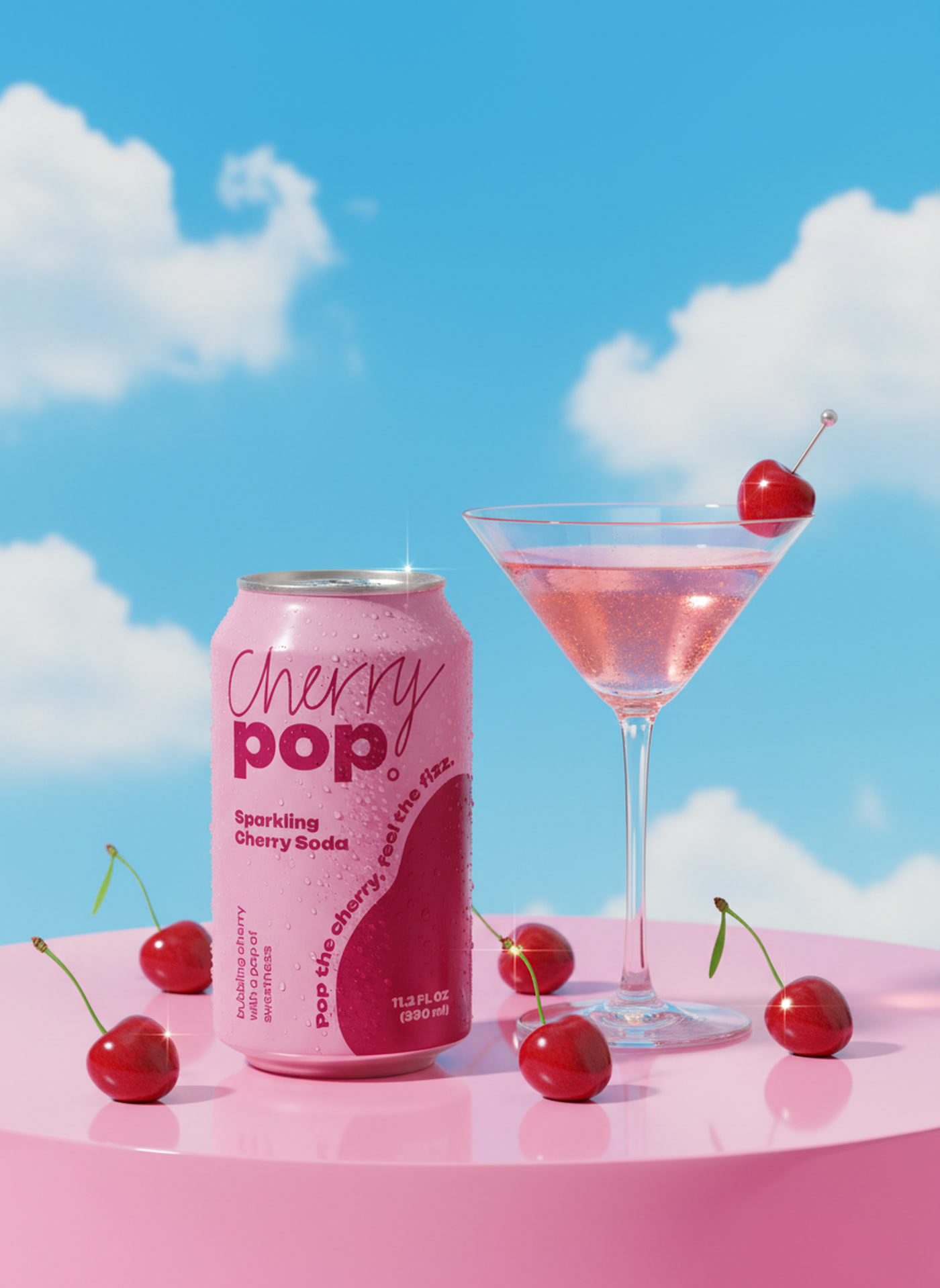
Cherry Pop was built around one specific second: the tab lifts, the fizz hits, and the whole thing tastes like summer before you have even swallowed. The brand had to deliver that feeling on the shelf, so we let the fruit lead and kept everything else short and loud.
Two cherries carry the identity. A soft blush that keeps the can sweet and light, and a deep wine red that gives it real fruit weight. The name is written by hand so it moves like a splash, and the promise is short enough to say out loud: pop the cherry, feel the fizz.
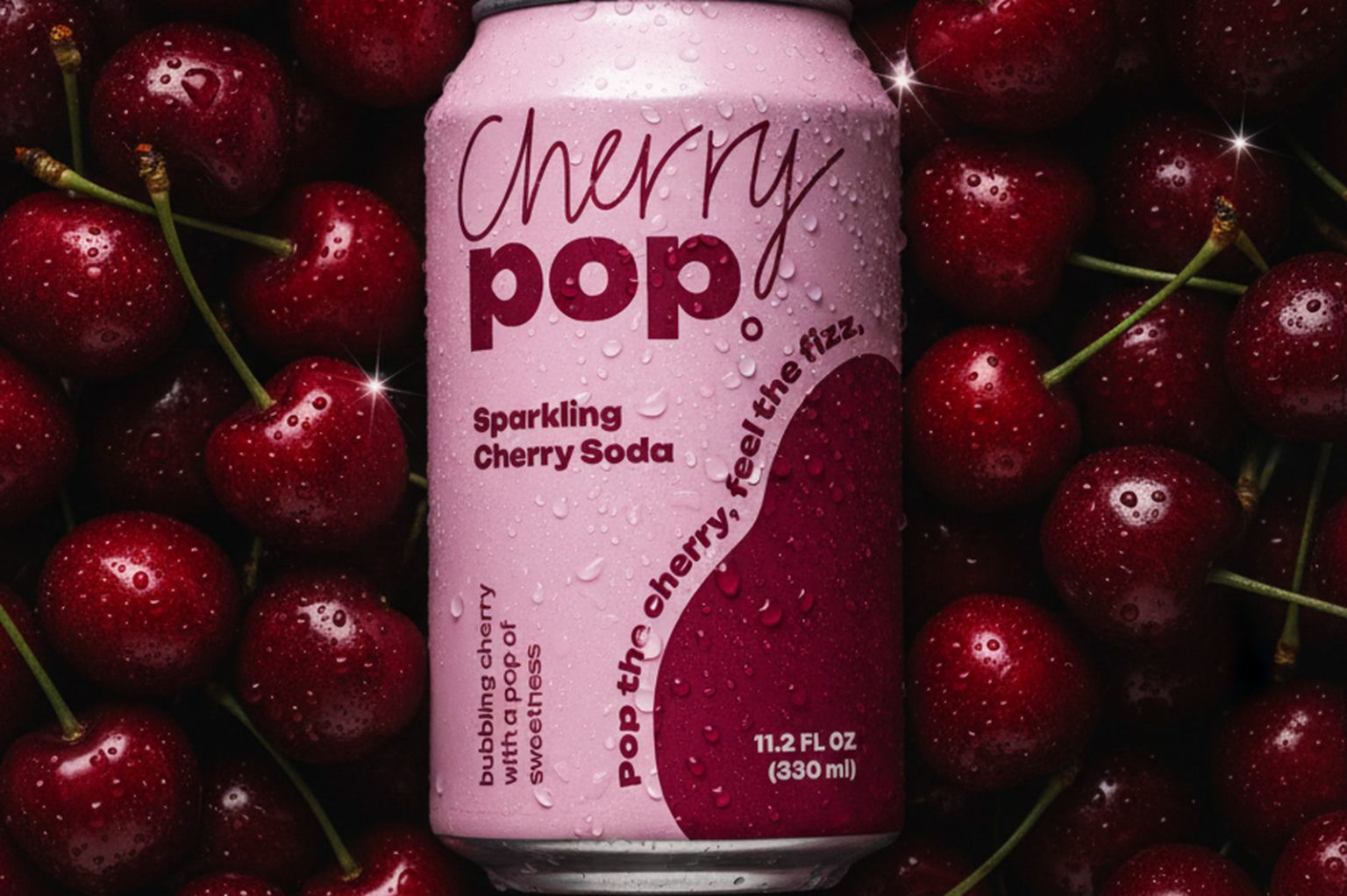
The can splits between the two reds on a soft curve, so the label reads as a piece of fruit rather than a grid. Typography stays minimal: a loose handwritten Cherry, a heavy rounded pop, and small print that wraps around the body so there is always something new when you turn the can. Every surface carries condensation, because the product should look cold before it looks designed.
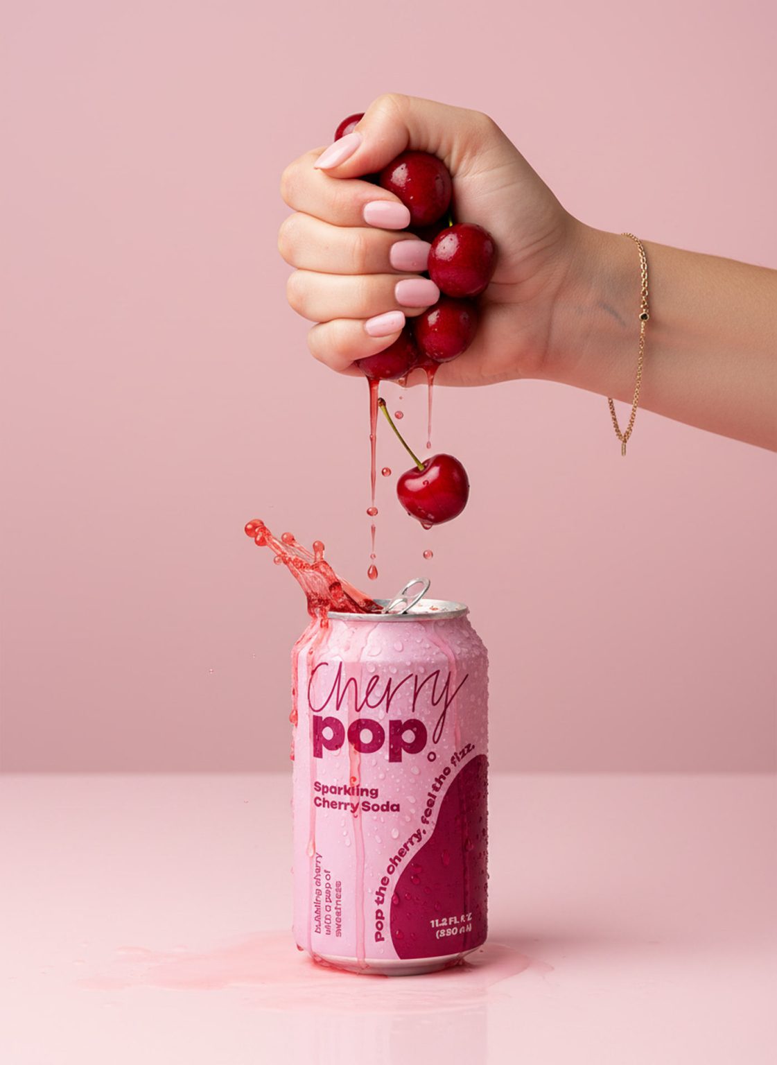
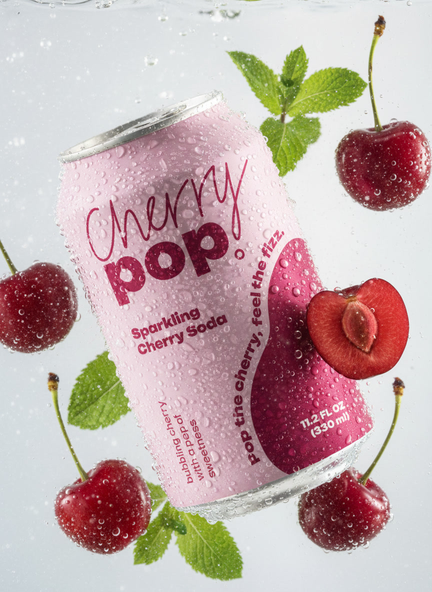
The photography moves between two temperatures. Studio pink for the quiet, product forward frames: cherries pressed by hand over an open can, a cocktail on a plinth, a fridge shelf lined with cans. Then open blue sky for the loud ones, where the can gets raised into the sun and the soda arcs behind it. Ice, water, mint and fresh fruit repeat across every scene, so the brand reads as one long summer instead of a set of separate posts.
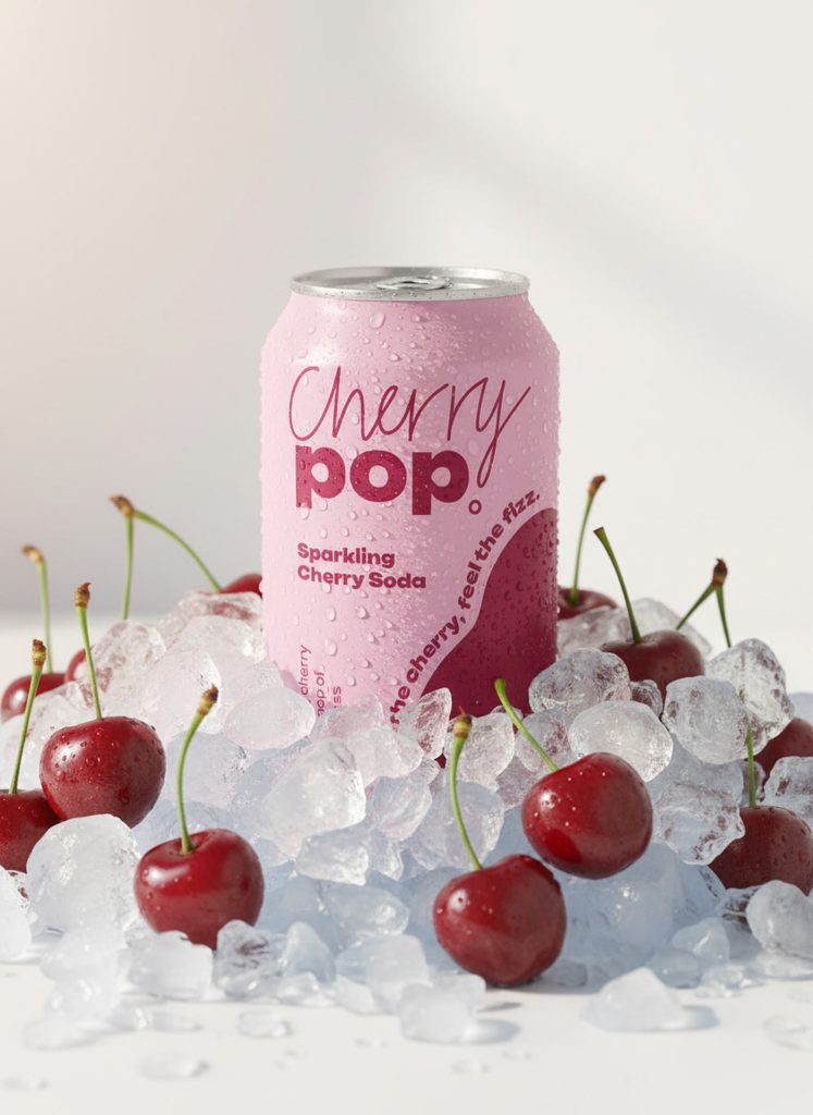
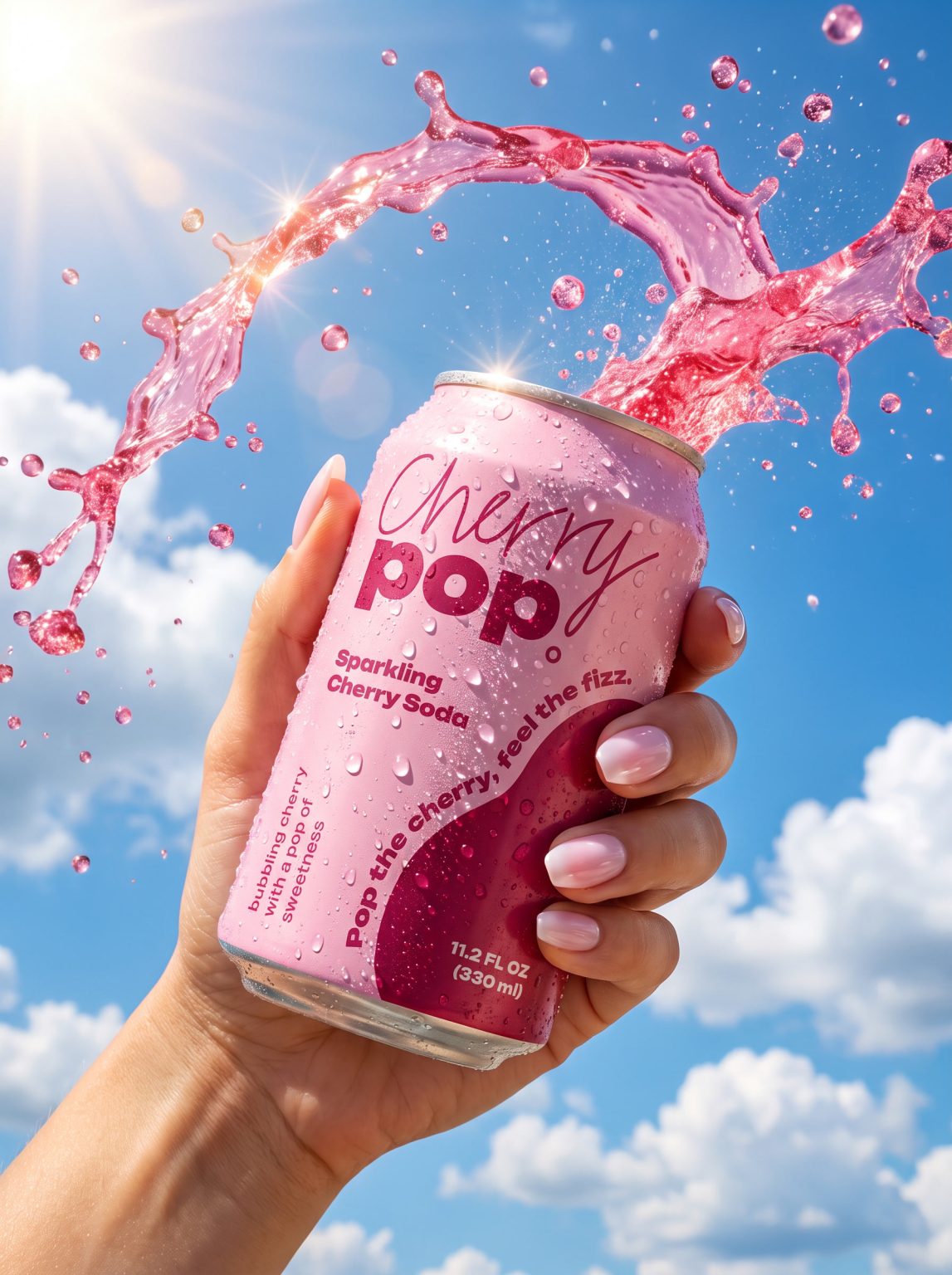
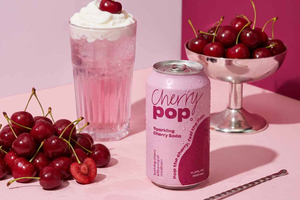
Every frame in this case comes out of our own production pipeline. We stage realistic AI photoshoots and build custom can mockups, then spend real hours in Adobe Photoshop and Illustrator on grading, retouching and compositing. Nothing is one-click generated. Each visual is art directed until the fizz, the condensation and the two reds feel unmistakably Cherry Pop, and stills, motion and campaign concepts all follow the same recipe so the brand feels like one world wherever you meet it.
Same process, your product. We build the identity, the packaging and the full visual world around it.
Start your project