
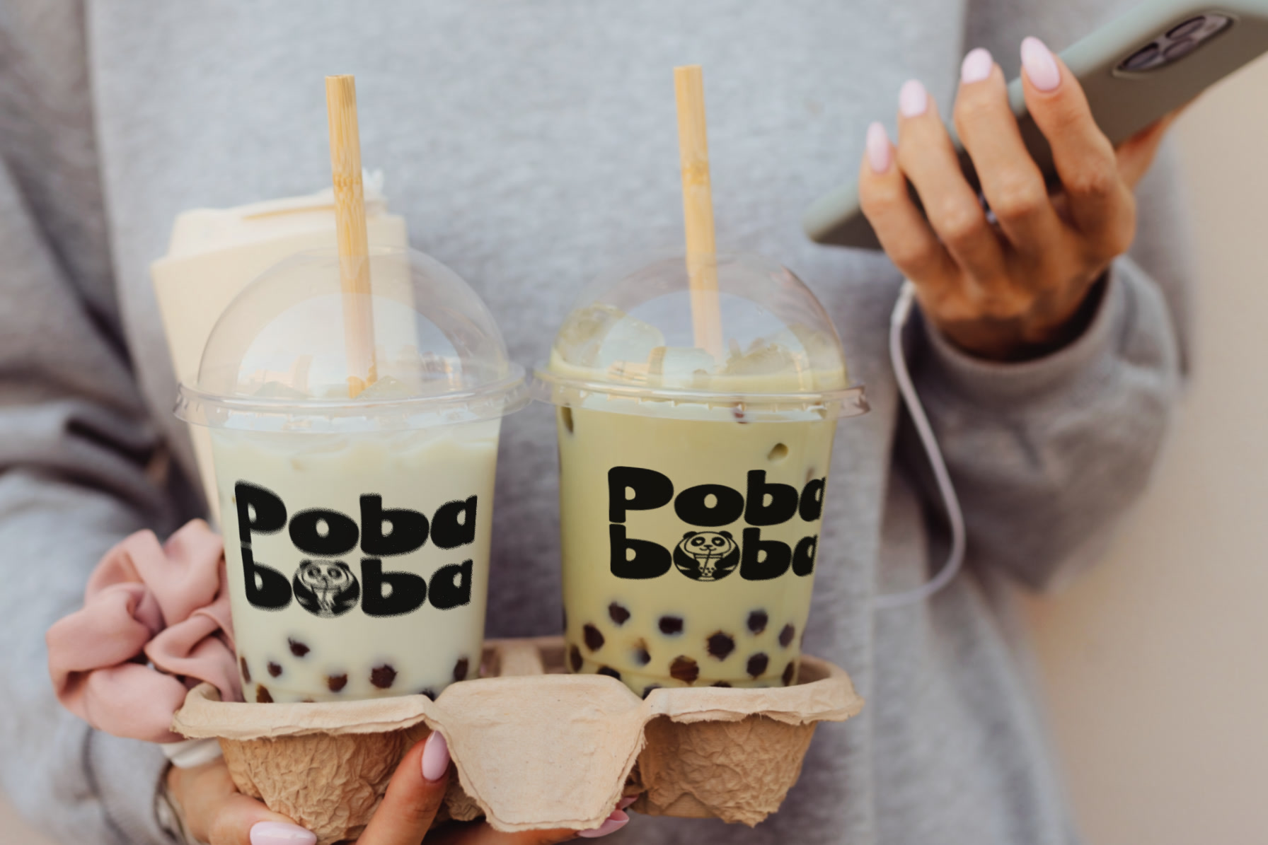
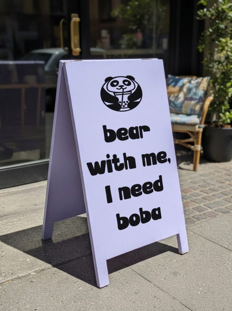
Poba Boba is a bubble tea brand built on a pun and a panda. The name says it out loud, the bear does the rest, and the tagline finishes the joke everywhere it lands: bear with me, I need boba.
The identity had to survive being held. This brand spends most of its life in someone's hand, outdoors, on the way somewhere, so the mark is heavy, black and simple enough to read at a glance through a cup of milk tea and a layer of tapioca.
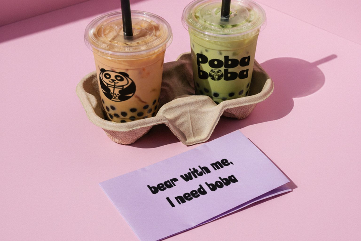
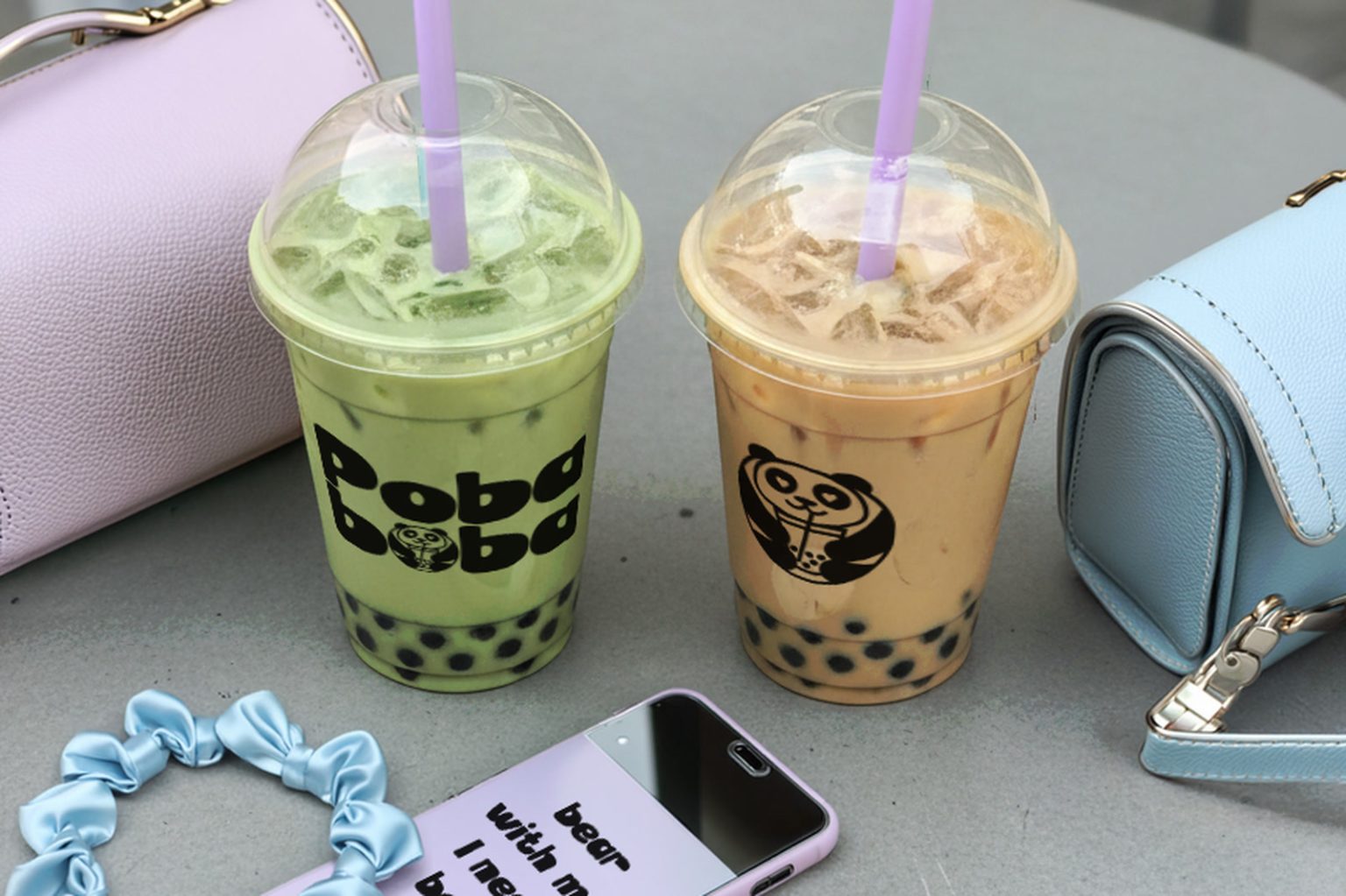
The palette is a dessert case. Soft lilac, powder pink, matcha green and warm cream, all kept pale so the black panda always wins. The wordmark is rounded and slightly bouncy, echoing the pearls at the bottom of the cup, and it sits low on the packaging where the drink is lightest. Nothing is glossy or corporate: clear cups, moulded pulp carriers, paper straws, and a flat lilac A frame on the pavement with the tagline set as large as it will go.
The photography stays close to real life. Cups on a cafe table next to a bag and a scrunchie, a drink carried across a car park, two cups balanced in a carrier on the way back. That everyday register is broken up by a few staged frames: a pink studio set with hard shadows, a matcha boba in bed with a sheet mask on. Pastels repeat in every scene, so the brand reads as one world whether the shot is styled or snapped on a phone.
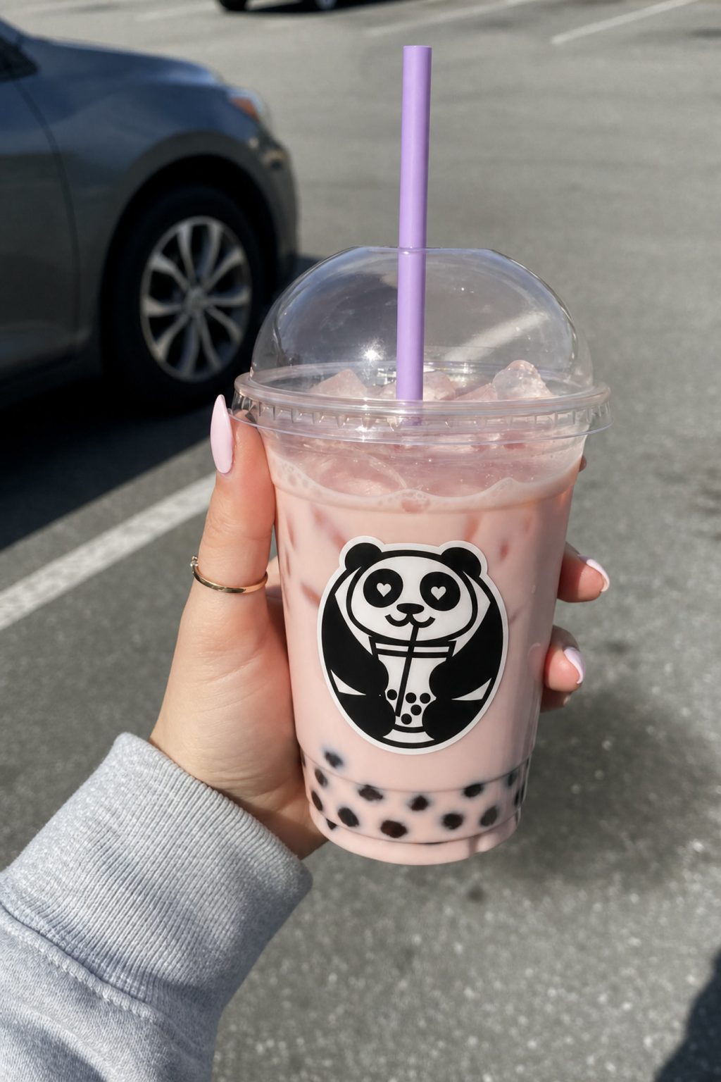
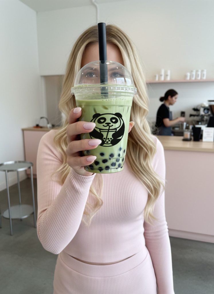
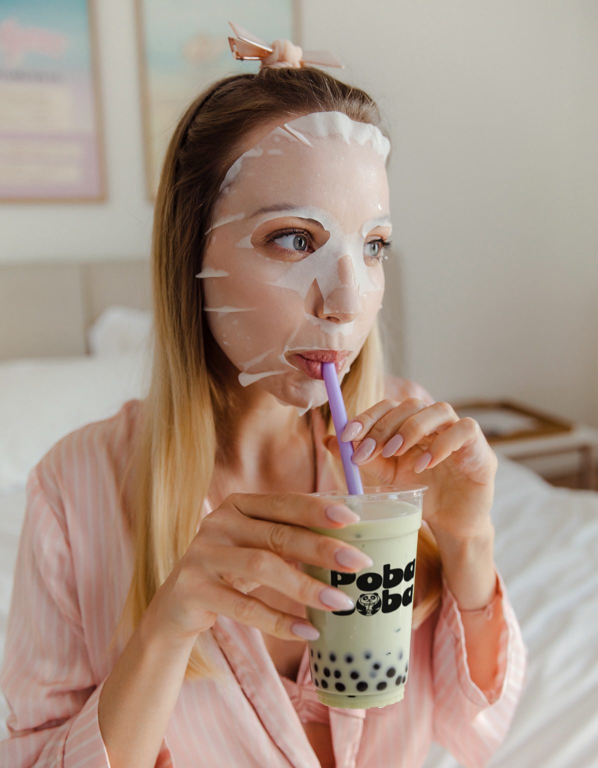
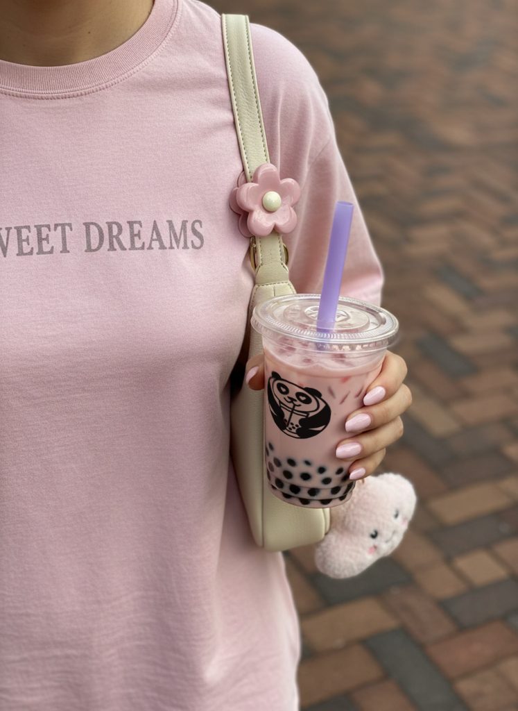
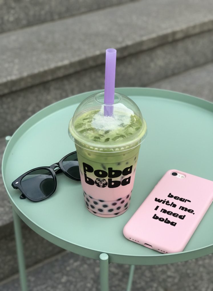
This brand world was produced end to end in our studio workflow. Realistic AI-powered photoshoots and custom packaging mockups are the raw material, and hours of hands-on craft in Adobe Illustrator and Photoshop turn them into finished visuals. We never settle for one-click results. Everything is art directed, edited and polished until it feels cohesive and unmistakably Poba Boba, from single product stills to motion content and complete campaign concepts, so the brand reads as one voice everywhere.
Identity, packaging and a full visual world, built the same way for your product.
Get a quote