
Bitmap Effect
The idea
That coarse, dotted, old print look, like a photocopied zine or a game from the nineties, is one of my favorite ways to make a poster feel less polished and more alive. In Adobe Illustrator it takes exactly one built in effect. No plugins, no Photoshop, and it works on placed photos and on vector type in the same way.
The best part is that it stays live. You can change the resolution, swap the image or edit a gradient afterwards and the dots update on their own.
watch the reel at @by.annie.n.
What you need
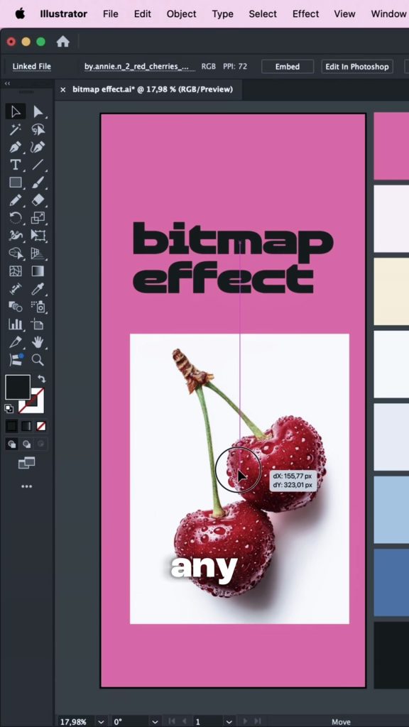
Any photo or vector object. For a photo, go to File > Place and drop it on the artboard. Images with clear contrast work best, my cherries on a white background turn into crisp dots while the white just disappears. For type, pick a bold font. Thin letters break up too much at low resolutions.
Apply Rasterize as an effect
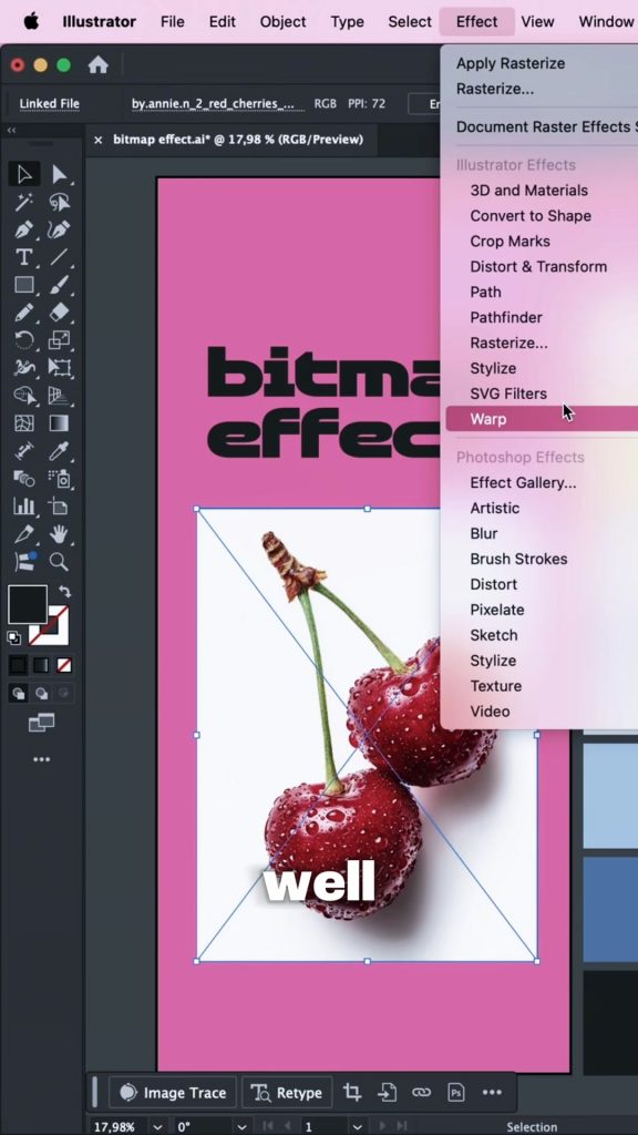
Select the image and go to Effect > Rasterize. Not Object > Rasterize. The Effect version is non destructive, so the original photo or text stays untouched underneath and you can change the settings later in the Appearance panel.
The settings
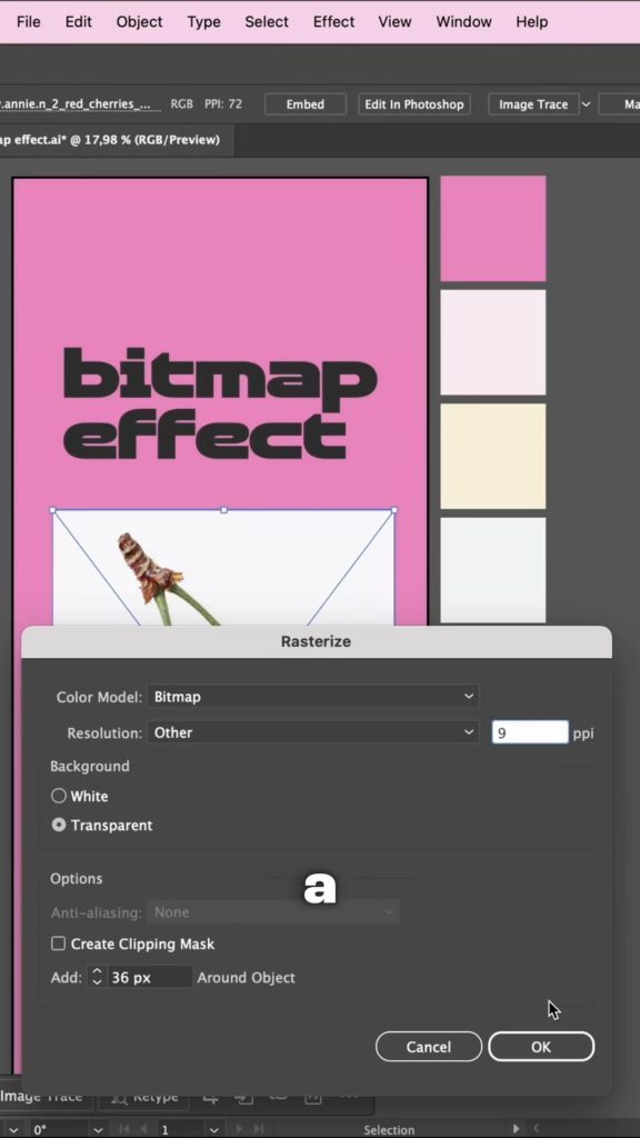
Set Color Model: Bitmap. Set Resolution: Other and type a low number. I usually go somewhere between 9 and 14 ppi. Nine gives big chunky dots, fourteen is finer, and anything above 30 starts to look like a normal grainy photo again. Set Background: Transparent so the light areas drop out and let your artboard color through. Click OK.
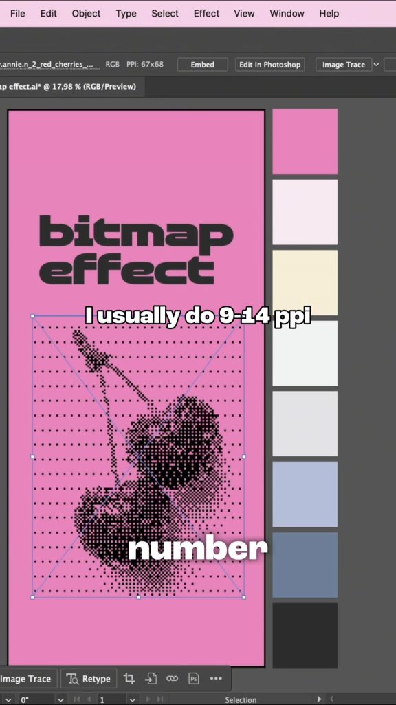
That is the photo done
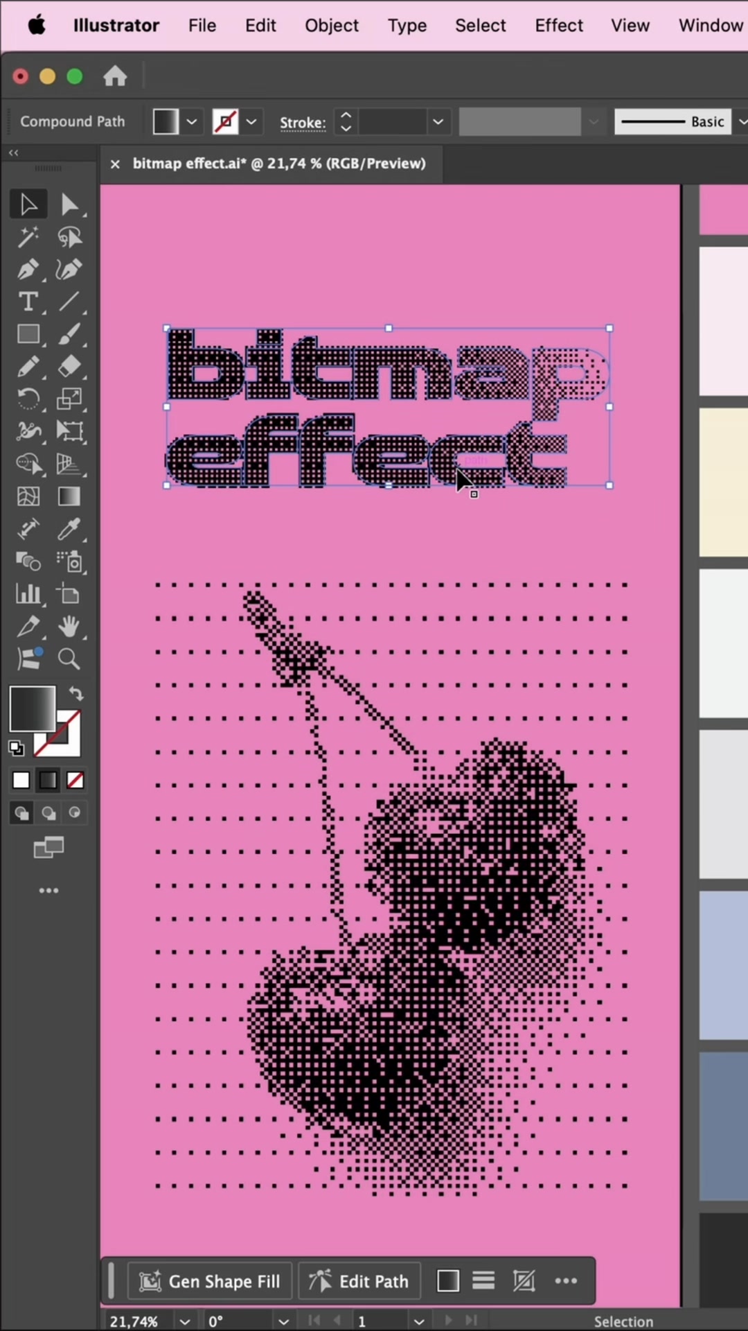
The cherries are now a pattern of black dots: dense where the photo was dark, sparse where it was light, and gone where it was white. If the dots feel too coarse, open the Appearance panel, click Rasterize and raise the ppi a few steps. A higher number always means finer dots.
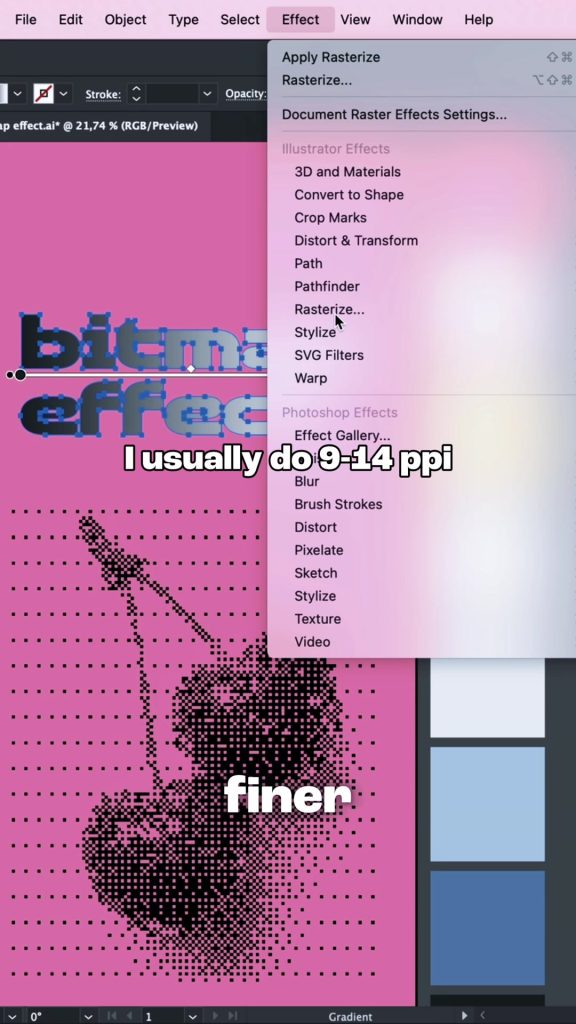
Do the same with type
This is where it gets fun. Give your text a gradient first, dark at the top fading to light at the bottom, using Window > Gradient. Then select the text and apply Effect > Rasterize with exactly the same settings. The dither follows the gradient: the dark end stays solid, the light end dissolves into dots.
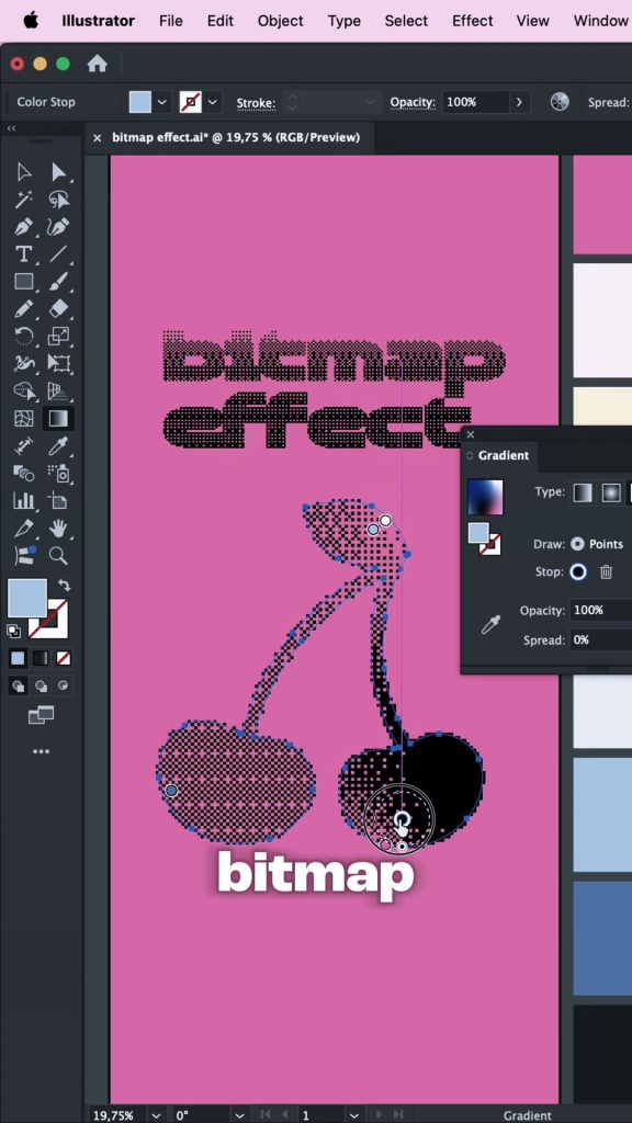
Tune the tone afterwards
Because the effect is live, you can keep editing. Open the Gradient panel and drag the color stops or the midpoint, and the dots redraw as you go. Pulling the dark stop down makes the letters more solid, pushing it up makes them dissolve sooner. This is how I get exactly the amount of grit I want without ever re applying the effect.
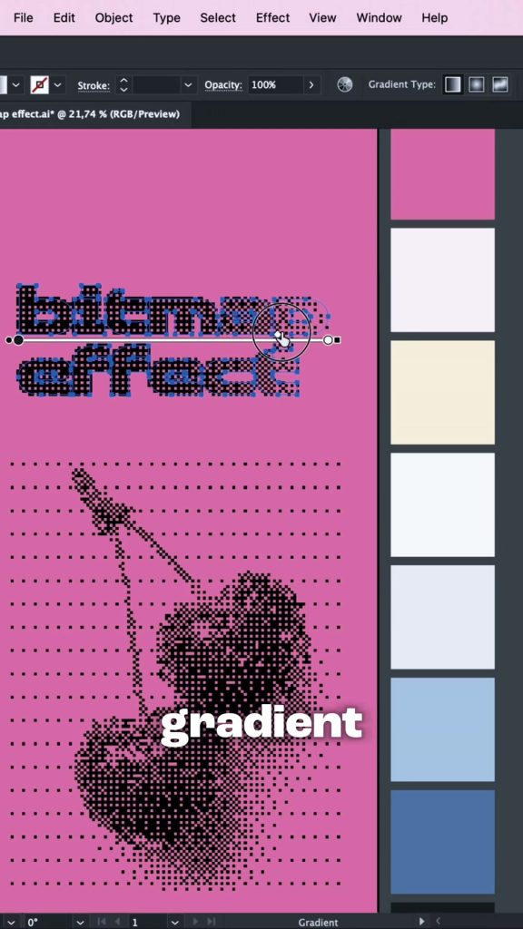
The result
A photo and a headline that look like they came off the same old press, made in about a minute with one effect. Everything is still editable, and if I need it as real vector I can run Image Trace on a copy at the very end.
Two small things that make a difference: the artboard color matters a lot because every white pixel becomes transparent, so try the same effect on cream, pink or black. And if you want the dots to line up between the photo and the text, keep the same ppi on both and align the objects to a whole number position.
New tutorials every week.
I share quick design tutorials as short videos on Instagram and in full right here on the site. Come say hi!
Follow @by.annie.n