
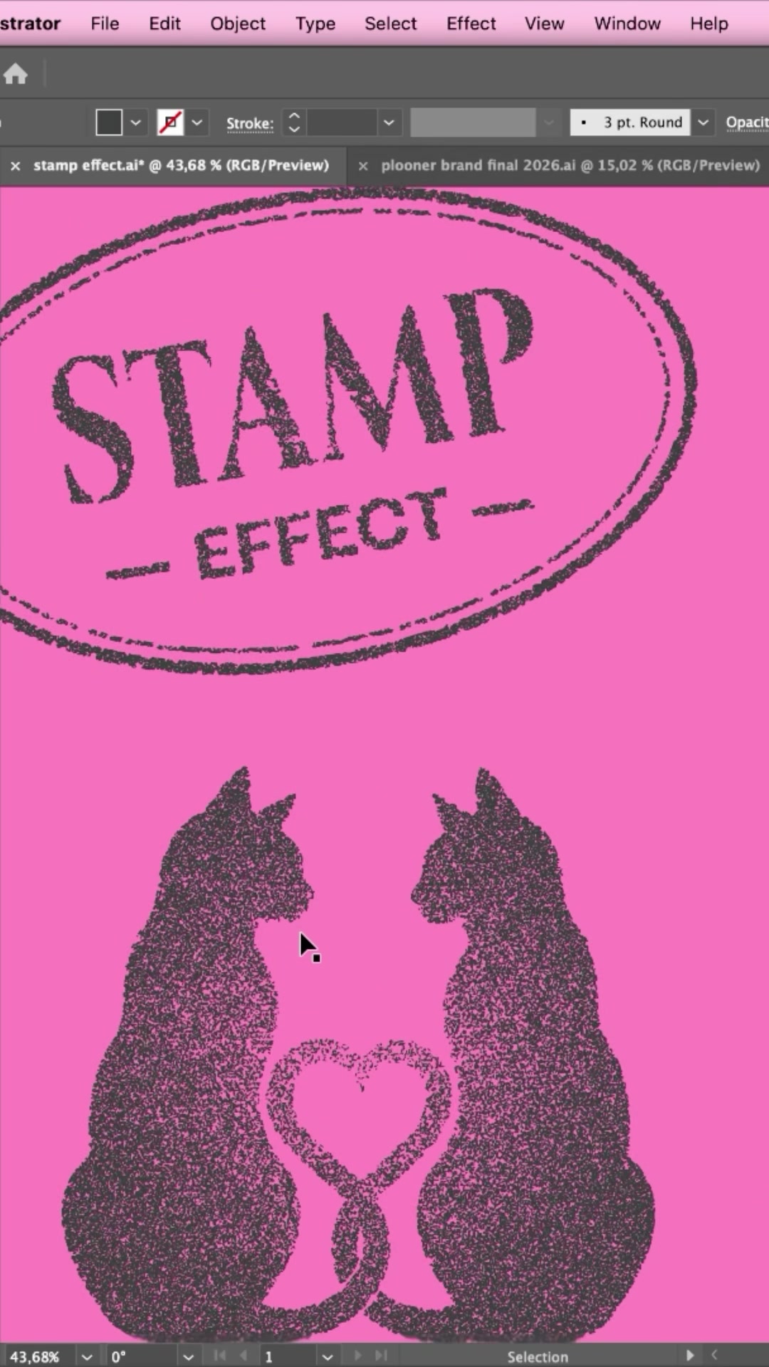
Stamp Effect
The idea
Flat vector shapes are clean, but sometimes I want a design to feel printed, pressed and a little imperfect. That is exactly what a stamp texture does: it takes a solid shape and gives it the grainy, slightly worn look of an old rubber stamp. This is one of my favorite tricks in Adobe Illustrator, and I use it all the time in my brand work. Everything happens with built in effects. No plugins, no brushes to download, and the result stays fully vector so it scales to any size.
The artwork in these screenshots is from one of my own projects, a pattern of cats, cards and wildlife, and the whole thing takes me about two minutes now that the recipe sits in my fingers.
watch the reel at @by.annie.n.
What you need
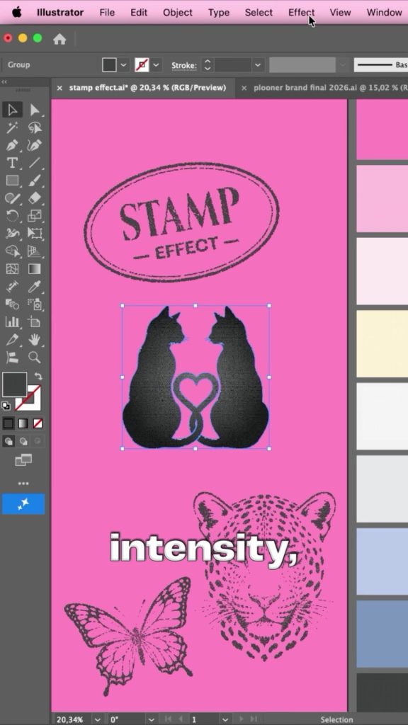
Any vector artwork in Illustrator. Solid shapes with a dark fill show the effect best, so logos, icons, silhouettes and display type are all perfect candidates. I always work on a copy so my original stays untouched.
Add texture with Stained Glass
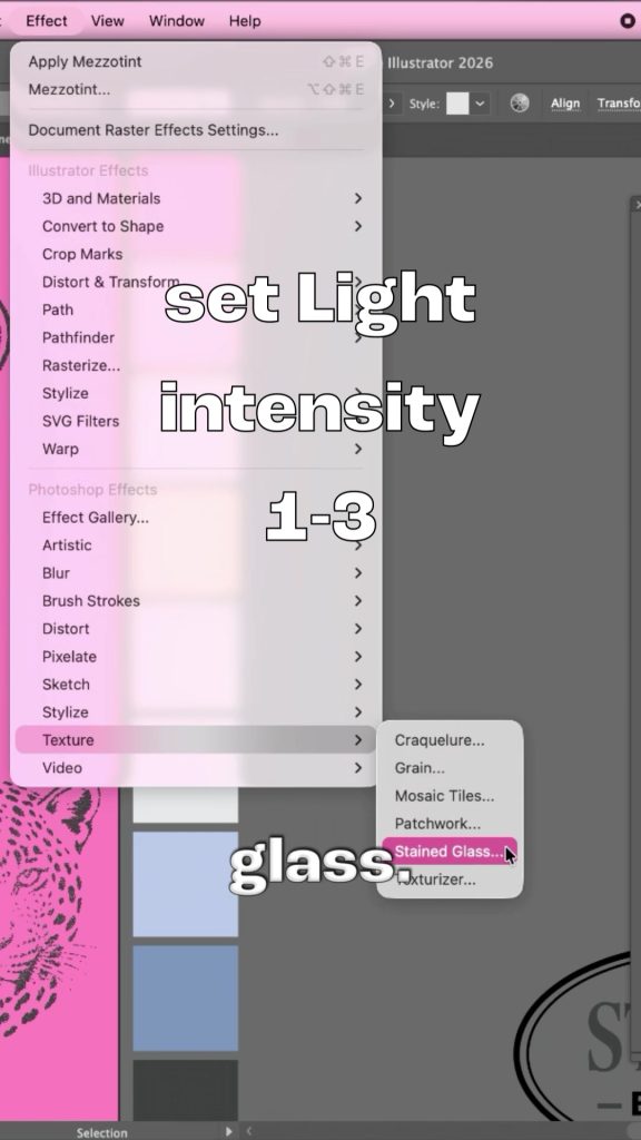
Select your artwork and go to Effect > Texture > Stained Glass. I know, stained glass sounds like the wrong tool, but with the right settings it breaks the solid fill into tiny irregular cells, and that becomes the base of the grain. I set the Light Intensity somewhere between 1 and 3 and keep the cell size small. Click OK and the shape immediately loses its flat, digital feel.
Roughen it up with Mezzotint
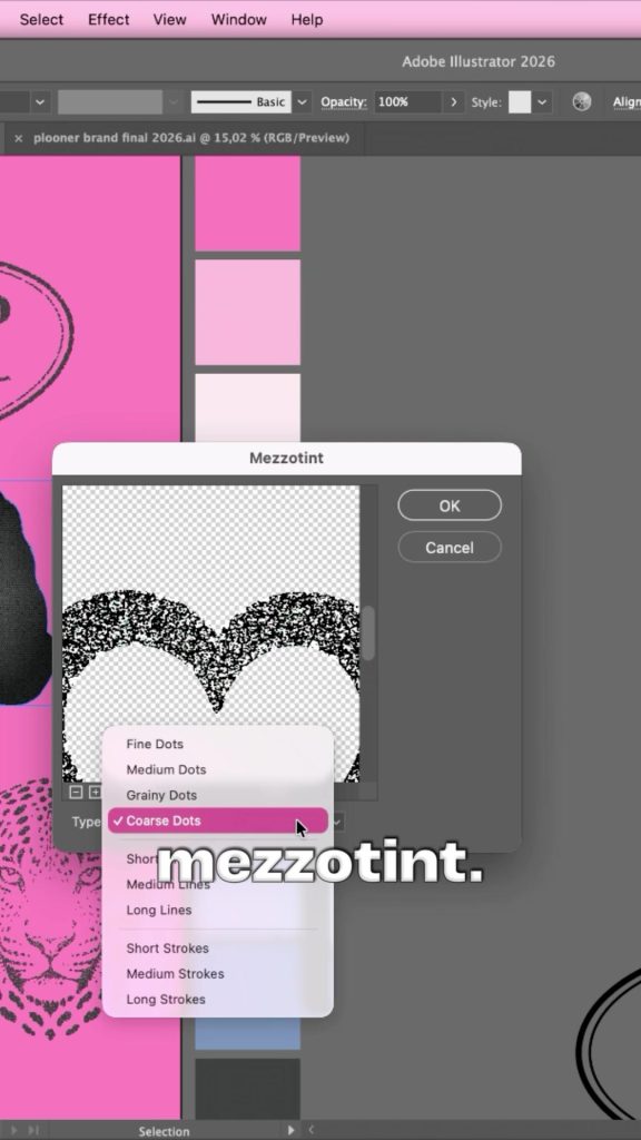
With the artwork still selected, go to Effect > Pixelate > Mezzotint. In the dialog I pick Coarse Dots and click OK. Mezzotint scatters the texture into speckles, and together with the Stained Glass pass it starts looking like ink on paper instead of pixels on a screen. If you want a finer grain, try Fine Dots or Grainy Dots and compare.
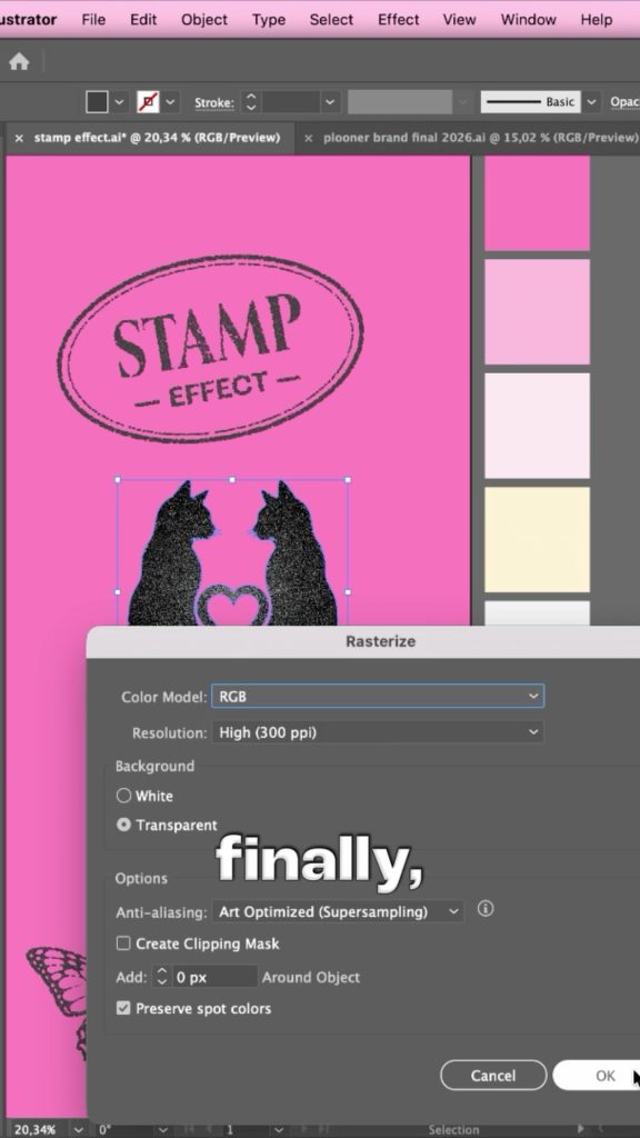
Rasterize the result
The effects so far are live, so I lock them in before tracing. Go to Object > Rasterize and use these settings: Color Model RGB, Resolution High, 300 ppi, Background Transparent. Click OK. The artwork is now a high resolution image with the grain baked in.
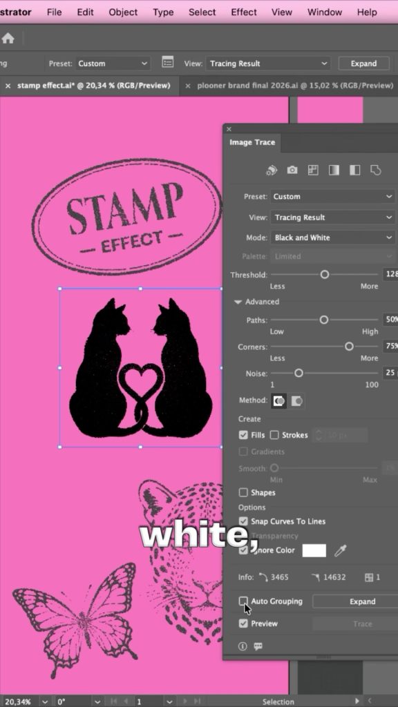
Trace it back to vector
Open the Image Trace panel from the Window menu and set the Mode to Black and White. Turn on Preview and check Ignore White so the background drops away. Then I drag the Threshold slider until the grain in the preview looks right, and fine tune Paths, Corners and Noise under Advanced if the edges feel too soft or too busy. When I am happy, I click Expand. The stamp texture is now clean, editable vector paths in whatever color you like.
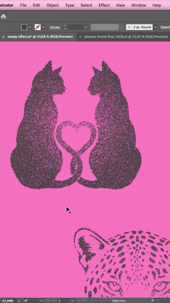
The result
Solid shapes go in, a warm, printed, handmade texture comes out. And because the final artwork is vector I can recolor it, scale it for packaging or print it huge without losing the effect.
A few things I have learned using this effect a lot: keep an untouched copy of the original shapes in a hidden layer, because you will want to rebalance the threshold at some point. It absolutely loves display type, so try it on a wordmark. And if the grain feels too even, run the artwork through the recipe twice with different Mezzotint types and blend the results.
New tutorials every week.
I share quick design tutorials as short videos on Instagram and in full right here on the site. Come say hi!
Follow @by.annie.n